- Testing Basics
- Home
- /
- Learning Hub
- /
- Responsive Design
- -
- December 18 2023
What is Responsive Design? Examples, Principles, and Best Practices
Responsive design is an approach that ensures websites adapt seamlessly across various devices and screen resolutions. Learn more!
Responsive design is an approach to ensure that the layout and content of a website are optimized for viewing on any device, irrespective of screen size or resolution. It uses flexible layouts, images, and media queries to build a website that conforms to the size of the user's device, thereby providing the user with the best possible viewing experience. So it’s like - access information almost anywhere, anytime.
The Internet is a vast network that has the power to connect people from all around the world. Due to its nature, it's time-sensitive, and people expect updates on their favorite websites anytime. People will leave a website immediately and look for something else if a website isn't responsive. This is why you must have a responsive and mobile-friendly website.
Mobile users have been rising due to how smartphones have become mainstream in the past five years. According to Statista, Internet users spent 58.33% of their time browsing the web on their mobile phones globally during the first quarter of 2023.
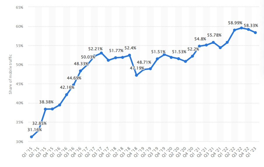
This represents an increase over the second quarter of 2022 when 55% of global Internet users accessed the Internet via mobile devices. There has been a significant increase in Internet usage via mobile devices between the third quarter of 2013 and the beginning of 2023.
Overview of Responsiveness
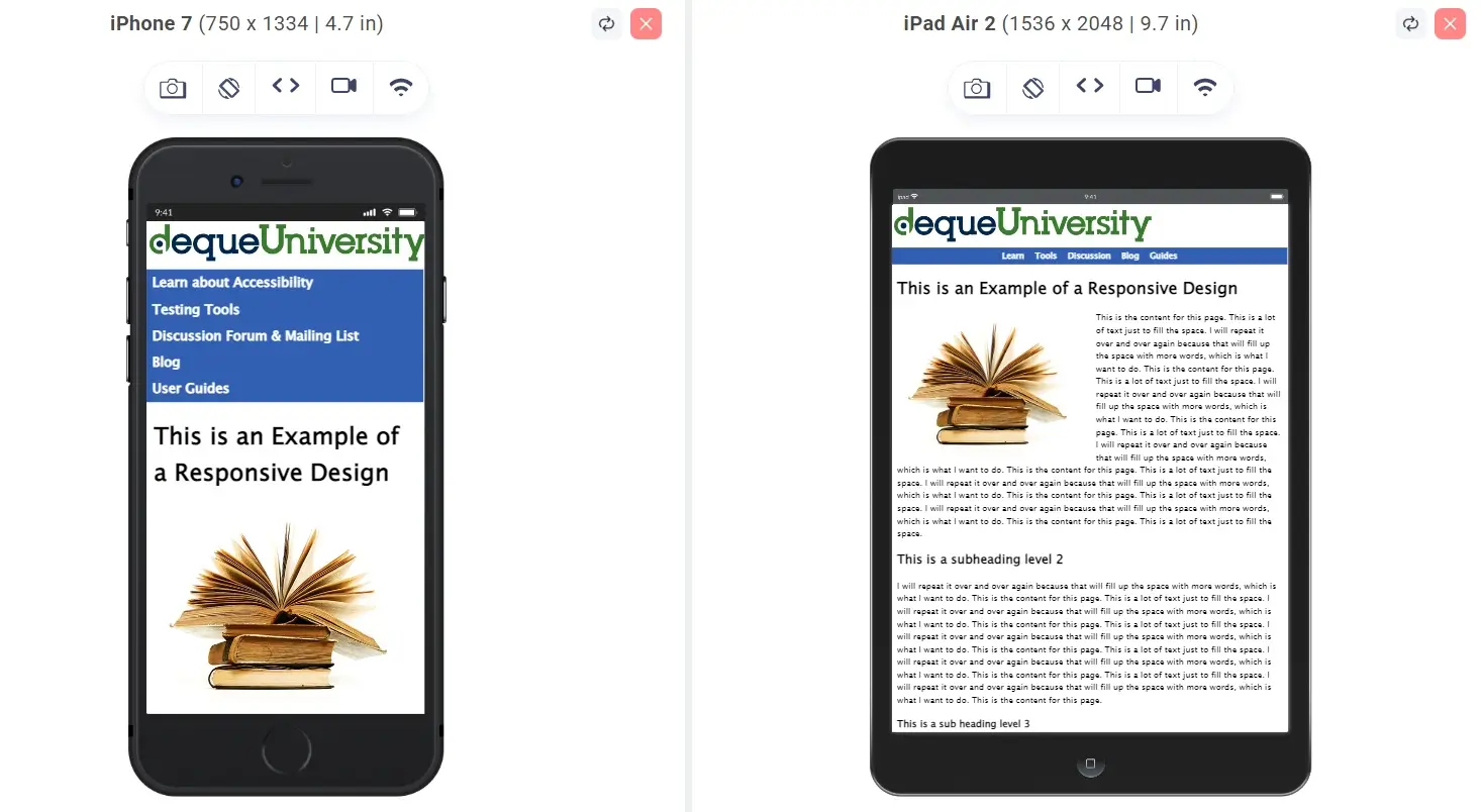
Responsiveness in a website means it can adapt on its own to fit the size of your mobile screen. To put it simply, a CSS responsive website "responds" to the size of your browser window or screen size. So, when you check it on your mobile, it automatically adjusts to show you a mobile-friendly version and when you switch to your desktop, it expands to fit the larger screen.
For example, a responsive website looks like this as shown below:
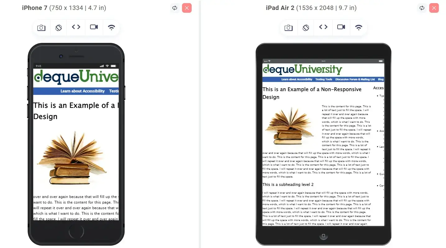
In contrast, a non-responsive website doesn't adjust automatically, and the result can look a bit messy, like this:
What is Responsive Web Design?
Responsive design is an approach to ensure that the content and screen sizes are compatible with each other. Hence, designers would size elements regarding appropriate relative units (%) to apply media queries to detect different things about the environment your website depends upon. These steps are taken into consideration to ensure that your web design and browser space are consistent with each other across various devices.
You can think of responsive design as a setup where your server would send the exact HTML code to different devices. You can use CSS to alter the page rendering on the device. With responsive design, you can cater to all devices using the same code, adjusting for screen size. Responsive design aims to help your content look better through increased font sizes and scaling your content to fit your screen. It would even show only a smart content part fitting the screen.
Now, let’s understand why responsive design matters in web development.
Why is Responsive Design So Important?
During the early 2010s, there came the era of mobile users dominating desktop users. This led the designers to think about different solutions to handle user experience. They had the option to recycle different designs into one and provide fixed dimensions for each of them. This approach is known as adaptive design. They can also opt for a single, flexible design, shrinking or stretching to fit your screen, also called a responsive design.
Designers and organizations found responsive design to be a smart option. Instead of working with absolute units, be it pixels or images on different versions, designers could focus on a single design for filling every “container”. This has made responsive design one of Google’s most important features.
This is especially handy for those who use their phones for everything from browsing to shopping and banking. According to Zippia, a whopping 82% of US shoppers make purchases on their smartphones, especially for entertainment and food. This highlights how crucial it is to ensure responsiveness.
So, responsive web design is a win for everyone – users, web designers, developers, and businesses. Instead of dealing with the hassle of building separate versions for different devices, it lets developers create one site that fits all screens—no need for an extra mobile version alongside the one optimized for desktop browsers.
In addition, there are more reasons to use responsive design. Let’s discuss them as well.
- Users can easily link and share the content using a single URL: Google’s algorithms can assign page indexing properties accurately without needing to prove that corresponding mobile/desktop pages are present. Save your resources when Googlebot ensures site crawling. In the case of responsive design pages, a single Googlebot user agent would have to crawl the page only once instead of multiple times with various user agents to retrieve every content version. This advantage over crawling can help Google index any other site content and ensure it’s updated and fresh.
- Consider JavaScript behavior: You can use JavaScript to make changes to the rendering and ensure smoother website behavior across various devices. JavaScript usage can include deciding which image resolution variant to show on your page.
- JavaScript adaptive: With this configuration, every device can access the same HTML, CSS, and JavaScript content. The website’s behavior or rendering gets altered when you execute JavaScript on your device. Whenever a website needs JavaScript, Google recommends this configuration.
- Combination of detection: Using this implementation, your website would leverage JavaScript and server-side detection of your device capabilities when you want to provide different content across various devices.
- Dynamic JavaScript: Using this configuration, every device gets access to the same HTML while the URL serves the JavaScript to serve various JavaScript codes dynamically. It all boils down to the device’s user agent.
- Vary:User-Agent HTTP header: This acts as a signal to different Googlebot and Internet caches to let them know that JavaScript can vary for different user agents. This also signals for Googlebot to crawl its JavaScript file with various Googlebot user agents.
Ensure you don’t block the page assets crawling of any kind- JavaScript, CSS, and images, for any sort of Googlebot with robots.txt or other methods. You need to be in a position to access the external files completely. This can help the algorithms detect the responsiveness of web design configuration and handle it carefully.
These are the popular JavaScript implementations for every mobile-friendly website:
For example, a page wouldn’t be partial to any device while serving the same HTML, including an <script> element requesting an external URL handling the JavaScript. Every device that requests the URL of the JavaScript would get access to the same code. While you execute them, JavaScript detects your device and alters the page. It can also include a smartphone-oriented image or add any code in place of the desktop alternatives.
With a combined detection setup, the server can work with JavaScript to detect a device's capabilities and alter the served content. There are cases where a website can alter the content rendering based on a smartphone or a desktop device.
The website can also include JavaScript detecting the screen's dimensions sent to your server and updating or altering the code sent across your device. JavaScript can use a cookie to store the detected device capabilities. The server can read this on subsequent visits from the device in use.
Considering that the server would return its various HTML code to different kinds of user agents, you can consider combined detection as a dynamic serving configuration type. The website should be in a position to include this command: Vary: User-agent HTTP response header when you request a URL serving different HTML content to various user agents.
Here, every device gets served with the same HTML, including an <script> element and an external JavaScript file with different content depending on your requesting user agent. This happens when the JavaScript code gets served dynamically. This is when you can use this command:
In the next section, we will explore the differences between responsive and adaptive web designs.
Responsive vs Adaptive Design – Key Differences
A big debate in the mobile world is whether to go for responsive or adaptive web design, or even have a standalone mobile site. But for now, let's skip standalone mobile sites. They're not a popular choice among designers and businesses because you have to create them separately, leading to higher upfront and maintenance costs.
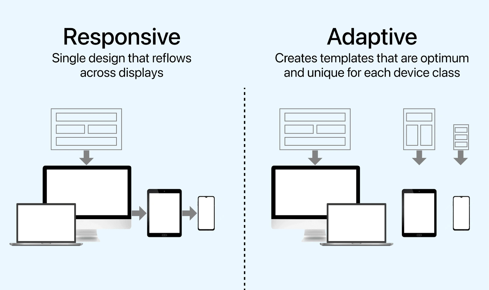
Responsive design smoothly adjusting to any screen size. It does this by using CSS media queries to tweak styles based on the device's features, such as display type, width, height, and so on. Just one set of these queries is enough for the responsive website to fit various screen sizes.
Now, adaptive design takes a different way. It sticks to fixed layouts determined by breakpoints. Once these are set during the initial load, they don't change, unlike responsive designs that keep adjusting.
Let’s find out how responsive design differs from adaptive design.
| Aspect | Responsive Design | Adaptive Design |
|---|---|---|
| Definition | Fluid layout that adjusts to different screen sizes. | Predefined layouts tailored for specific screen sizes. |
| Flexibility | Adapts to various screen sizes dynamically. | Has fixed layouts for specific breakpoints. |
| Development Complexity | More complex due to fluidity and flexibility. | Can be less complex with predetermined layouts. |
| Breakpoints | Uses CSS media queries for breakpoints. | Has predefined breakpoints for specific devices. |
| Performance | One design fits all, which may result in unnecessary code. | Optimized for specific devices, potentially faster. |
| User Experience | Consistent and optimized for all devices. | Optimized for specific devices only. |
| Maintenance | Easier to maintain with one codebase. | May require more maintenance due to multiple layouts. |
From the above differences, it is clear that having a responsive web design can bring a host of benefits to designers, developers, businesses, and, most importantly, users. Let's have a look at them in the next section.
What are the Benefits of Responsive Design?
There are several benefits of responsive design. Here are a few of them:
- High Mobile Traffic: As of 2023, over half of the top U.S. website traffic came from mobile devices (Statista). It's crucial for websites to look good on smaller screens. Responsive design is gaining popularity because it's versatile and costs less than maintaining separate mobile versions.
- Faster Mobile Development at Lower Costs: Building one responsive website takes less time and cost than creating both a standalone mobile app and an adaptive web design. The initial investment may seem higher, but the long-term savings on maintenance and configuration costs make it a cost-effective choice.
- Lower Maintenance Needs: Maintaining a separate mobile site involves extra testing and support. Responsive design streamlines this by using standardized testing methods for optimal layouts on all screens. It eliminates the need for two content strategies, two administrative interfaces, and potentially two design teams.
- Faster Pages: Responsive design, incorporating modern performance techniques, ensures faster loading times, catering to the needs of mobile users.
- Lower Bounce Rates: A responsive and optimized mobile site provides a better user experience, keeping visitors engaged for longer. Non-responsive sites make it harder to retain visitors, leading to higher bounce rates.
- Higher Conversion Rates: Consistent user experience across devices is crucial for converting visitors into customers. Redirecting users to device-specific sites can be time-consuming and frustrating, making them more likely to turn to competitors.
- Boost SEO: Responsive design is crucial for search engine optimization. Google uses mobile-friendliness as a ranking factor, and having a single responsive site avoids issues with duplicate content that can harm search rankings.
- Seamless Browsing Experience: Consistency is key for first impressions. Visitors should have a positive experience whether they're using a desktop or a smartphone. Responsive design ensures a seamless browsing experience.
Here, we have discussed the benefits of responsive design. Let’s have a look at its popular examples.
Popular Examples of Responsive Design
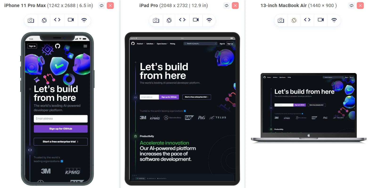
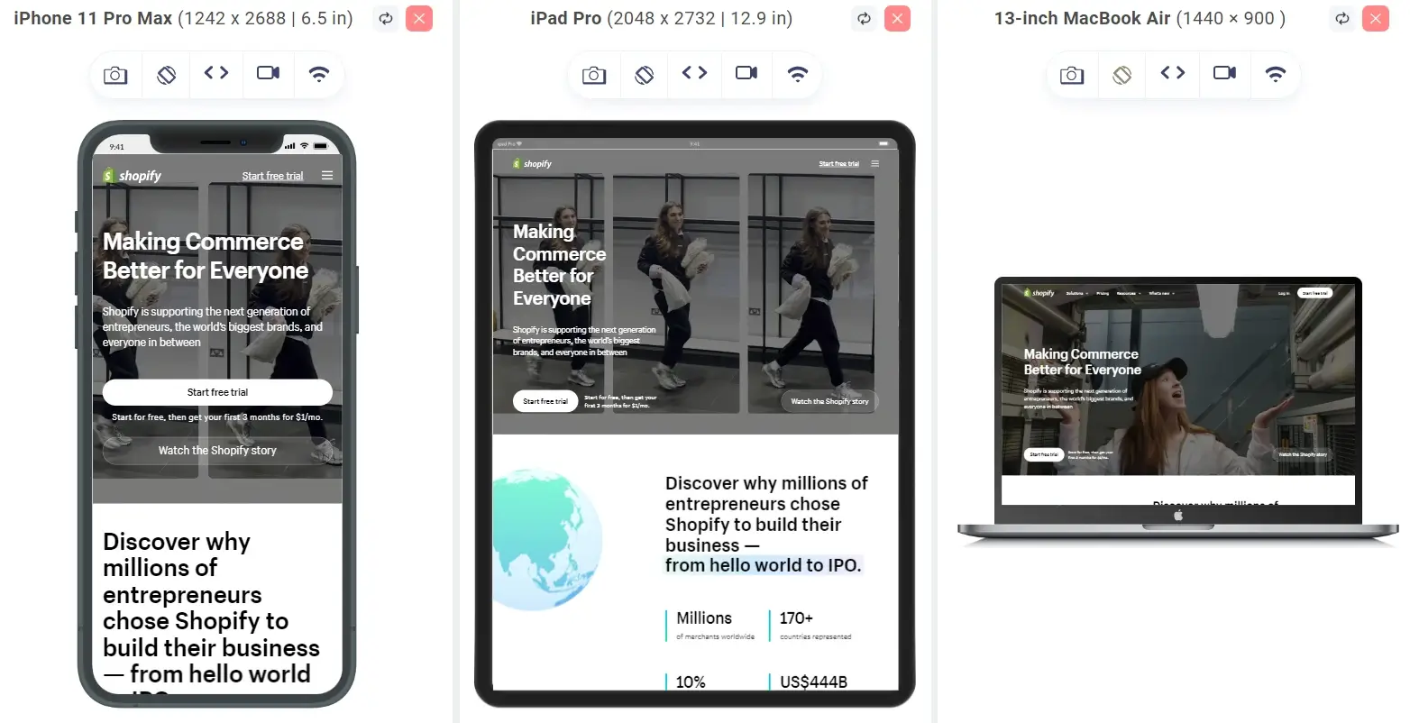
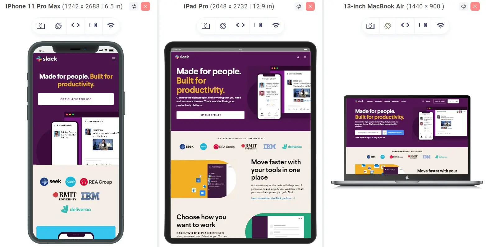
Shown below are some examples of organizations using responsive web design.
GitHub:
Shopify:
Slack:
Dribble:
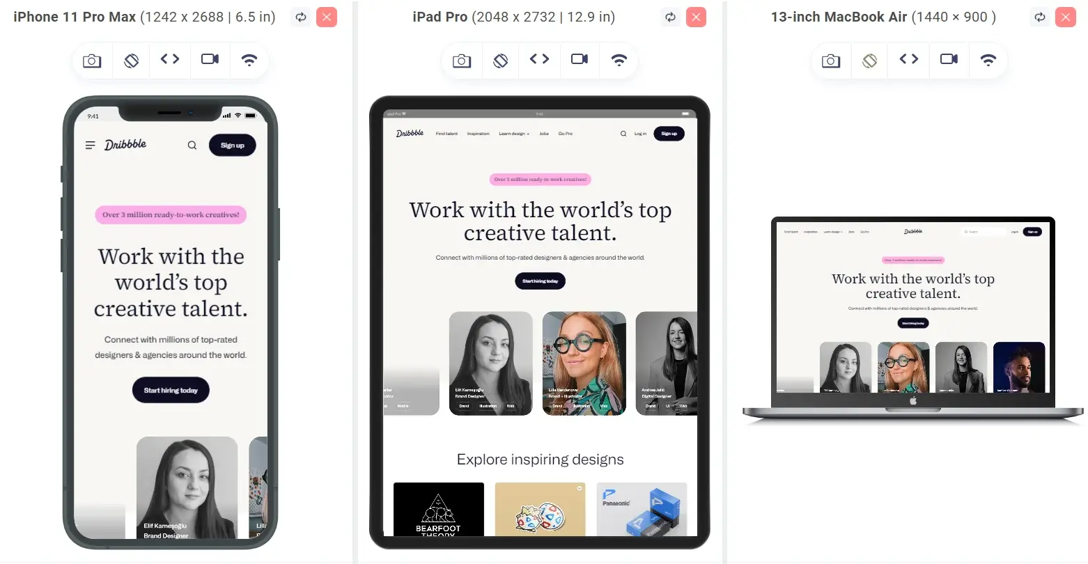
The above examples show the importance of responsive design in day-to-day businesses. Now, let’s see the core principles of responsive web design to understand how it is a cornerstone to helping businesses succeed in today’s mobile world.
Core Principles of Responsive Design
There are three core principles of responsive design:
- Fluid Grid System: It helps in structuring information in building consistent user experiences. In interaction design, grids come in various types like multi-column, hierarchical, and modular. The key principle is —each element occupies a uniform space, allowing components to seamlessly scale up or down as users switch between devices.
- Fluid Images: In responsive design, fluid images dynamically scale to fit their container. As the browser hits a breakpoint, these images resize to match the current window size. For icons, you can consider using SVG files—they're lightweight and can be scaled to any resolution without compromising quality.
- Media Queries and Breakpoints: Media queries act as filters, detecting the dimensions of the browsing device to ensure a visually appropriate design for any screen size. Breakpoints complement media queries, marking values where your website's content rearranges to offer the best user experience.
Also, it's better to adopt a mobile-first design strategy with media queries, defining the mobile layout first and then scaling up. Testing content helps identify breakpoints, and over time, you may even predict them based on a device's screen resolution—responsive design thrives on adaptability, ensuring a seamless user experience across diverse devices.
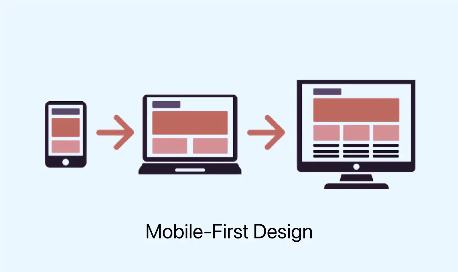
Each device, be it a laptop, desktop, tablet, smartphone, or other, has a unique screen width variation from others. Therefore, each device requires its specific responsive breakpoint, also known as CSS breakpoints. We will look at them in the upcoming section.
Common Responsive Breakpoints
It's not very practical to set different standard CSS breakpoints for every device out there. To make things simpler, we choose specific breakpoints based on the content of the webpage that should generally work well across most devices on the market.
| Device Category | CSS Breakpoints Range |
|---|---|
| Mobile devices | 320 px - 480 px |
| Tablets | 480 px - 768 px |
| Small screens and laptops | 769 px - 1024 px |
| Desktops and large screens | 1025 px - 1200 px |
| TVs and extra-large screens | 1201 px and above |
You can effortlessly incorporate these standard CSS breakpoints into your web project, ensuring responsiveness across various devices.
While many websites still rely on traditional CSS styling methods, a growing number of developers are turning to CSS frameworks for their user-friendly features. These frameworks, widely used in the developer community and also align with the use of media query breakpoints.
Screen size constantly changes, and it's crucial that your website can adjust to any screen size, both now and in the future. Moreover, devices come with various features (like touchscreens) that users interact with. Modern responsive design takes all these factors into account to enhance the experience for everyone. Let’s discuss some basics of responsive design you should know when developing your websites or web applications.
Getting Started With Responsive Web Design
In this section, we will discuss some basics of responsive design that you should implement when designing your websites.
- Specify the Viewport: Defining a viewport is important so that web content adapts seamlessly to various device screens. To define this, the meta viewport tag is used within the HTML code. The content attribute of this tag contains information that guides the browser on scaling and sizing content during page rendering.
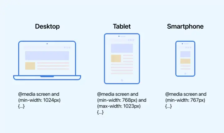
- CSS Media Queries: When adjusting the size of your webpage elements, avoid assigning fixed widths and ensure relevant content displays appropriately. CSS media queries, introduced in CSS3, play a crucial role in this adaptation to different devices and screen sizes.
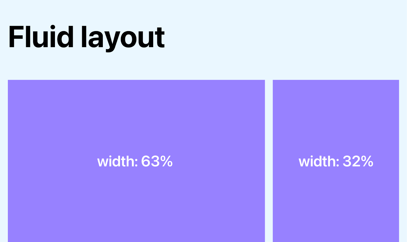
- Fluid Layouts: In today's web design, having a fluid layout is crucial for making websites responsive. In the past, we used to assign fixed values to HTML elements, such as specifying a width of 600 pixels. However, with a fluid layout, we use dynamic values, usually a percentage of the viewport width. This means that the sizes of various container elements adjust dynamically, expanding or contracting based on the screen size. It's a more flexible approach that adapts well to different devices and screen sizes.
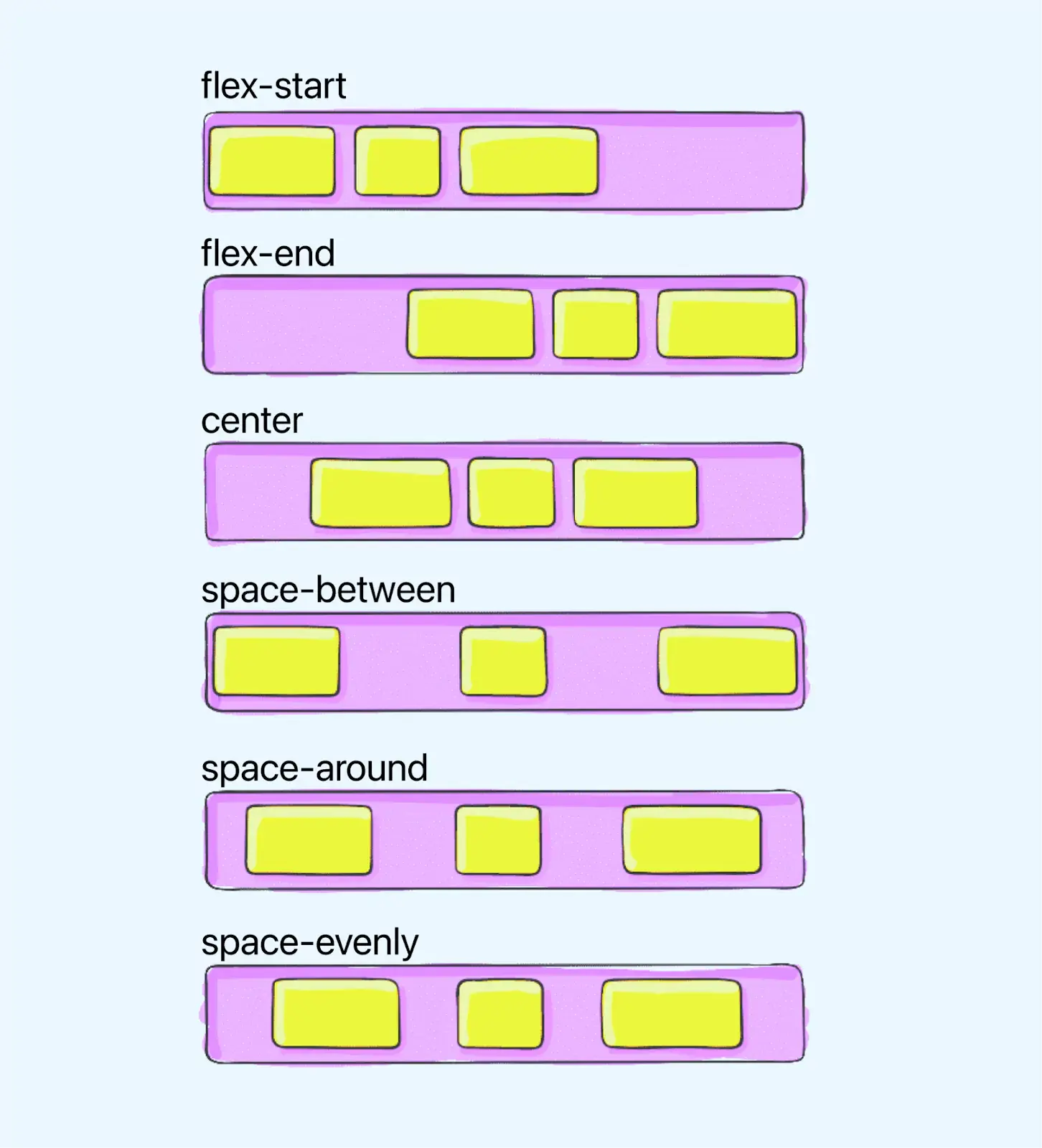
- Flexbox Layouts: Even though a percentage-based layout is fluid, some designers and web developers found it lacking in dynamism and flexibility. Flexbox in CSS is a module can be used to provide a more efficient method for arranging multiple elements, especially when you're unsure about the size of the content within a container.
- Texts and Images: Optimizing text involves considerations like the number of words per line for smaller devices and determining the smallest legible text size for a particular scale and viewport. For responsive images, linking image width to the container's width ensures adaptability, but this approach may have performance overhead, especially on mobile devices.
- Tables: To address data tables with many columns, you can make them responsive by converting each row into an element or hiding columns for smaller screens, providing a button for users to render additional columns.
- Navigation menus: They can be made responsive by converting links to a drop-down menu or creating a hidden menu accessible through a swipe or click.
- Speed: When you are working on making your website responsive, speed is a crucial factor. As per nobaseurl rel="nofollow" Customedialabs, bounce rates of eCommerce websites range between 20%-45%, whereas for B2B websites, it is 25%-55%.
Without the viewport meta tag, mobile browsers will display the pages with desktop dimensions. To achieve responsiveness, parameters such as initial-scale, minimum-scale, and maximum-scale must be defined within the meta viewport tag. Once the viewport is defined, you need to adjust page elements accordingly, ensuring that users can scroll vertically without the need for horizontal scrolling.
Media queries enable dynamic adjustments based on criteria such as device width. For instance, you can set specific font sizes for different screen widths using the media attribute in the link tag. Additionally, the @media keyword in CSS3 allows associating CSS properties based on screen filters, eliminating the need for separate files for different screen sizes.
In a flex container, items can expand to occupy available space or shrink to avoid overflow. Flex containers come with unique properties, such as justify-content, which you can't tweak with a regular HTML element. This adds a layer of versatility to your layout options.
So, your strategy for responsiveness shouldn't unnecessarily slow down your page's initial display. There are various ways to speed up your pages. Consider optimizing your images, incorporating caching, minifying, adopting a more efficient CSS layout, steering clear of render-blocking JavaScript, and enhancing your critical rendering path. These are all crucial points to boost your site's speed.
The world is shifting to a mobile-first world and any website that doesn't adapt to this shift risks being left behind. Most businesses now have a robust online presence, but many fail to meet today's customer expectations by not optimizing their websites for mobile devices. To create an effective, responsive design, you need tools to quickly and easily update your website without redeveloping it completely.
Tools for Responsive Design
Making your website responsive is a win-win—it's great for your visitors, boosts your search engine optimization (SEO), and takes some load off your shoulders since you only have one site to build and maintain.
But if you're just starting in web design, the idea of creating a responsive website might seem like a lot to handle. There are tools out there that can make the whole adaptive design process a lot more user-friendly.
Here are some popular tools for responsive web design:
- Bootstrap: Bootstrap is a CSS framework for creating responsive designs. It's a CSS library adopted by many web designers and developers who want to build mobile-friendly websites. The framework includes HTML and CSS templates that can be used on any website, making it easier to create custom designs.
- Gridset: Gridset is a highly customizable, simple-to-use plugin that allows designers to quickly and easily create beautiful responsive grids and code them into their WordPress website.
- Werify: Wirefy is a tool to make responsive design easier. Its flexible grid system allows designers and developers to quickly create wireframe-style mockups of websites in the browser. It's made with CSS3, so it works on browsers that support it and degrades gracefully on browsers that don't.
- Gumby 2: Gumby 2 is a new and improved version of the responsive front-end framework introduced by Gumby Framework. It improves on Gumby's original CSS, making it easier to use and more flexible.
- Invision: Invision has long been a go-to tool for web designers. Its capabilities for collaboration and design specs are indispensable for teams of all sizes. Because Invision is responsive, it's easy to adjust designs to fit any screen size or orientation. This feature is handy when dealing with mobile-first design. Invision can help you understand and organize your responsive workflow more efficiently if you start with responsive design.
When you create websites or web apps, they must be compatible with a multitude of screen sizes like smartphones, tablets, desktops, and laptops. So, it's crucial to perform responsive design testing to build responsive websites. However, a responsive design checklist is important before you start responsive testing.
Checklist for Responsive Design Testing
Shown below is the checklist for responsive design testing you can refer to while creating your mobile-friendly websites or web applications.
- Test for Navigation on Website: Ensure that your website's navigation is intuitive and user-friendly. Check that all menu items are accessible, and navigation elements function correctly across various web pages.
- Test Fonts on Multiple Devices: Verify that the chosen fonts are visually appealing and works on different devices. Ensure consistency in font rendering across various screen sizes and resolutions.
- Test on Device-Browser Combinations: Evaluate how your website performs on different devices and browsers. It's important to identify and address any compatibility issues that may arise due to variations in browser rendering.
- Test on Small Screen Devices: Check the responsiveness of your website on small screen devices, such as smartphones. Validate that the content is scaled correctly and that users can easily interact with the site on smaller screens.
- Test the Speed of Your Website: Check the loading speed of your website. Optimize images, code, and other elements to ensure quick loading times. Faster websites generally provide a better user experience.
- Test for Element Alignments: Ensure that all elements on your website align properly. Misaligned elements can create a visually unappealing and unprofessional appearance.
- Test for Content Placement: Ensure that your content is well-placed and organized logically. Check that images, text, and other media elements are positioned correctly and contribute to a cohesive layout.
- Test for Cross-Browser Compatibility Issues: Perform cross browser testing to identify any issues that may arise due to variations in browser standards. Ensure a consistent user experience across popular web browsers.
- Test Website Popups Mobile-Friendliness: If your website uses popups, verify their mobile-friendliness. Popups should not obstruct the user experience on smaller screens, and they should be easy to dismiss or interact with on mobile devices.
- Test the Website as a User: Conduct end-to-end testing by navigating through your website as a user would. This helps identify any potential issues with the user journey and ensures a smooth experience.
However, there are more aspects you should consider while responsive testing. For this, we recommend you check this detailed responsive design testing checklist. Post that, you can start your responsive testing.
Note : Test your web designs across 3000+ real environments. Try LambdaTest Now!
How to Test Your Responsive Web Designs?
To test how your website performs across various screen sizes, you need to consider multiple factors, including checking user interaction, page loading, images, navigation, text alignments, and more. Carrying out these tasks manually would be a tedious task. Therefore, you need an all-in-one solution for your responsive testing.
Therefore, investing in robust and free mobile-friendly testertools like LT Browser is a feasible and time-saving option. LT Browser is a complementary tool offered by the LambdaTest platform.
With LT Browser, you can perform responsive design testing across 50+ pre-installed device viewports like mobile, tablets, desktops, and laptops.
To get tutorials on automation testing,mobile app testing, and more, subscribe to our LambdaTest YouTube Channel.
It also has tons of features to help you run responsiveness tests. Here are the ones:
- Leverage the latest Chromium version for quick testing.
- Experience a clearer and attractive UI for enhanced user interaction.
- Simultaneously test with up to 6 devices for increased efficiency.
- Use dedicated DevTools tailored for different viewports.
- Test with an unlimited number of custom device viewports for comprehensive coverage.
- Generate and share multiple error reports seamlessly.
- Customize testing with Chromium settings and install Chrome extensions.
- Effortlessly manage unlimited browser tabs to launch various device viewports.
- Record testing sessions with flexibility, capturing the entire screen or specific browser tab.
For example, following the different versions of Slack website on mobile, tablet, and laptop.
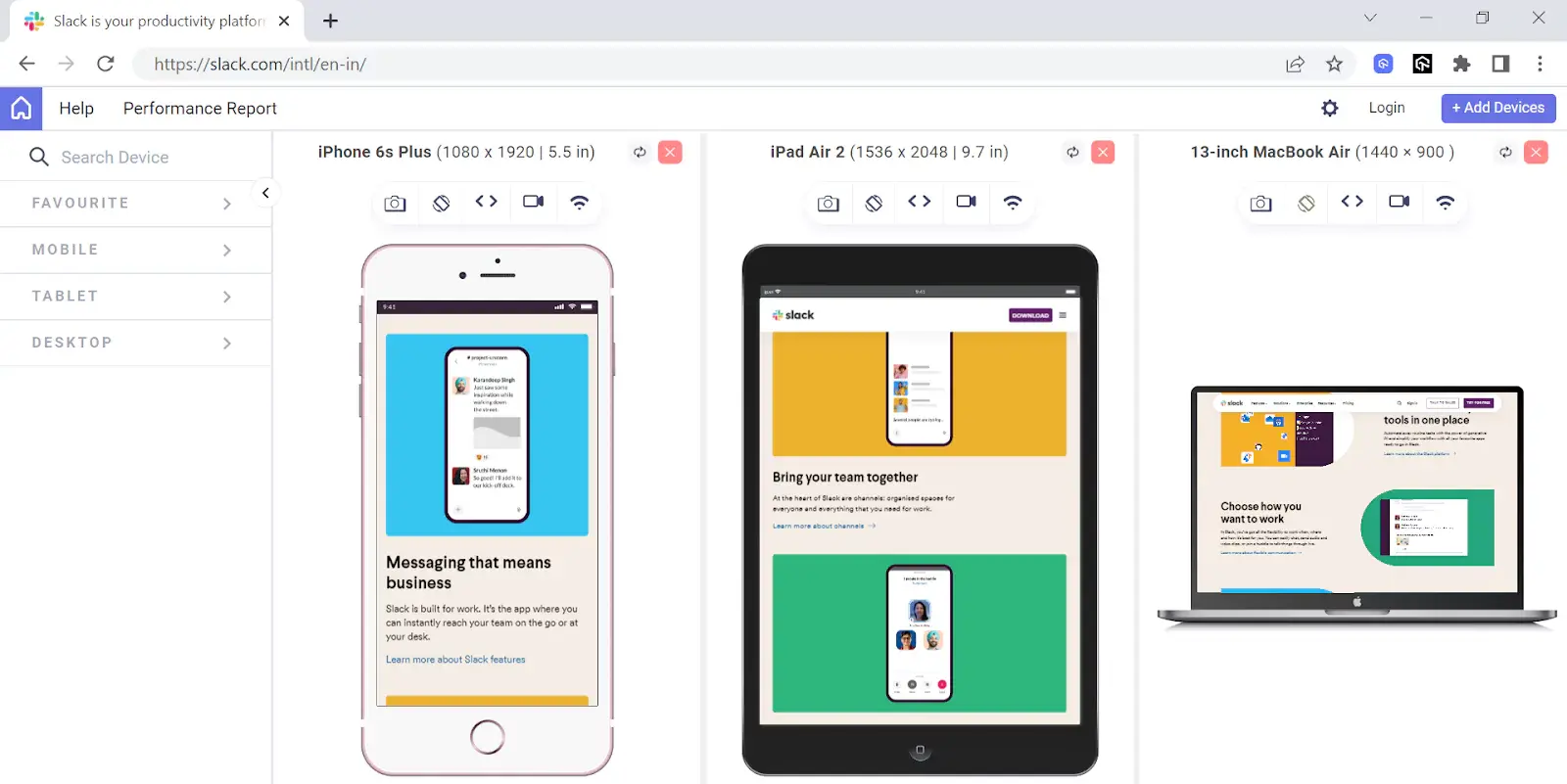
To start your responsive design testing using LT Browser, refer to the support documentation: Getting Started with LT Browser.
Ensure your website has a responsive web design, i.e., your content adapts to different devices automatically, and you’re ready. But you’re bound to face some challenges while making your website responsive. Let’s discuss this in the next section.
Responsive Design Challenges
As mentioned above, you might face a few challenges while ensuring responsive design. Some of the major challenges are as follows:
- Navigation: A website's navigation menu provides you with directions across the webpage. Responsive navigation needs to adapt in size based on the screen dimensions, but maintaining a consistent structure is crucial. Altering the navigation layout for different devices can confuse users accessing website from various platforms.
- Desktop vs Mobile View: Consider a website designed with a 200px padding. While it may appear fine when viewed on desktop, the same website can appear messy and disorganized when accessed on a mobile device. This discrepancy poses a major challenge for responsive web design, and it is imperative to be mindful of this issue when testing the mobile view of website.
- Cross Browser Compatibility: When creating a website with responsive web design, it's crucial to ensure consistent functionality across various platforms, meaning the website's behavior should remain unchanged when viewed on different browsers.
- Slow Page Loading: If you come across a fully responsive website but has a slow loading time, it can prompt users or customers to abandon it and seek alternatives. The primary reason for this is that responsive websites weigh a lot.
- Render Data on Small Screen Sizes: Managing large amounts of data displayed in tables, especially those with numerous rows and columns, poses a challenge when it comes to showcasing them on smaller screens with responsive design. Adapting the dimensions of tables to the screen size becomes particularly challenging when dealing with complex and detailed tables.
- Hide and Show Elements: In the process of developing a responsive website, CSS helps in displaying and hiding specific elements on the page. By leveraging CSS properties, the website can dynamically interact with various screen sizes, ensuring the adaptive adjustment of content for an enhanced user interface.

Responsive design relies on CSS3 media queries, a feature widely supported by modern browsers. These queries dynamically assess the screen size of a device and adjust the content accordingly. By incorporating a series of media queries, you can display various layouts tailored to different screen sizes.
However, it's important to note that some older browsers lack support for media queries (Firefox 2-3 and Internet Explorer 6-8). In that case, it's recommended to perform browser compatibility testing. Refer to this article on key browser statistics to consider popular browsers while performing cross browser compatibility testing.
Best Practices to Ensure Responsive Design
Here are a few best practices to help you avoid mistakes in responsive design and overcome its challenges.
- Begin by Prioritizing Mobile Design: While starting your website design, it might be common to think about desktop first, but opting for a mobile-first approach is often a better choice. Mobile devices pose more challenges that designers eventually need to tackle. By focusing on them initially, you reduce the risk of encountering major issues with your initial design as you create other versions. Prioritizing simplicity and clarity, crucial for mobile websites, helps you establish a user-friendly design from the beginning.
- Carefully Select Your Fonts: Web designers often choose fonts based on visual appeal and how well they complement the website's style. However, it's crucial to consider whether a font can smoothly transition between website versions. While thin lettering may look good on a desktop; it can become unreadable when scaled down for mobile users.
- Create Scalable Navigation: When users switch between versions of your website, it's important that navigation remains user-friendly. Scalable navigation adjusts the position of menus and navigation bars so that a reduction in display size doesn't hide them or make them hard to click. If simplifying navigation features for mobile devices is necessary, prioritize showing the options most users need.
- Minimize Friction for Mobile Devices: Friction refers to design features that hampers user activity. While desktop users can easily load new pages and interact with various website features, mobile users prefer simplistic design with minimal loading requirements. For instance, on mobile versions, consider allowing users to create their accounts on a single page to avoid interruptions to their initial activity.
- Incorporate Icons: Where suitable, replace text with icons. Icons eliminate distractions from unnecessary text and help users across all versions in navigating your website easily. Especially on mobile devices, icons maintain clean and visually appealing pages. They also offer an opportunity to enhance your brand image by incorporating features of your logo or products, creating a unified and efficient design that impresses users with its creativity.
- Optimize Images: Images often play a central role in website design. To ensure images remain striking and representative of your intended design, you must optimize them. Crop images for each version to meet viewport dimensions. Assign different resolutions for each device type to allow users with small displays to load smaller-resolution images when accessing your website.
- Use Smartphone Ergonomics: Mobile users navigate websites using their thumbs. When adapting features for mobile versions, make user input as easy as possible. You can consider using large buttons for easier tapping, expanding text fields for easier selection, using built-in assets for simplified data input, such as smartphone cameras for credit card scanning, placing important features within easy reach of thumbs.
- Visual Hierarchies: Visual hierarchies make website features proportional to their importance. This helps in making initial layout decisions by giving priority to user needs. When adding, removing, or adjusting the scale of design elements, it's essential to consider whether users can quickly identify the content they are looking for.
- Landscape View: While most users engage with websites in portrait view, it's crucial to consider landscape view, where users rotate their devices 90 degrees. Some tablets use it as their default orientation. In landscape view, scrolling becomes more challenging. Consider using left-right sliders instead of scroll functions where possible.
- Balance Fluid Layouts and Responsive Breakpoints: Fluid layouts automatically adjust layout features to reflect changes in window size, ensuring all content fits on a user screen. Responsive breakpoints alter the layout itself as users adjust window size past certain thresholds without making features smaller.
- Test Each Version on Real Devices: To fully understand the user experience your website provides, test it on as different real devices as possible. Recruit users to test each version and ask them to give feedback. Assess potential usability issues and survey users on how their experience with your website affects their perception of your brand or desire to purchase your product.
So, you need to test each font across various devices. Font size 16 is the default for many browsers and usually works fine across all website versions. When formatting headings, consider making the font size at least one and a half times larger than the body text size.
Experiment with different settings to find the right balance. Fluid layouts let users adjust windows, but without breakpoints, content might become too small. Use breakpoints sparingly to protect the user experience.
To test your web design in real user conditions, procuring each device is not feasible or expensive. In this case, you can consider cloud-based testing platforms like LambdaTest, an AI-powered test orchestration and execution platform, to leverage its real device cloud containing actual Android and iOS smartphones.
Conclusion
Responsive web design and the methods we've talked about will work when done right, and can make the user experience better. Having said that, there is a need to keep up with new devices, screen sizes, and web technologies to keep improving the user experience.
With responsive web design, we can create custom solutions for a large chunk of users on a wider variety of devices. A website can work well for someone using a legacy device just as much as it does for most people with the latest devices. This inclusivity also covers the few users with the advanced smartphones now and in the future.
On this page
- Overview of Responsiveness
- What is Responsive Web Design?
- Why is Responsive Design So Important?
- Responsive vs Adaptive Design – Key Differences
- What are the Benefits of Responsive Design?
- Popular Examples of Responsive Design
- Core Principles of Responsive Design
- Common Responsive Breakpoints
- Getting Started With Responsive Web Design
- Tools for Responsive Design
- Checklist for Responsive Design Testing
- How to Test Your Responsive Web Designs?
- Responsive Design Challenges
- Best Practices to Ensure Responsive Design
- Frequently Asked Questions
Frequently asked questions
- General
Author's Profile

Salman Khan
Salman works as a Digital Marketing Manager at LambdaTest. With over four years in the software testing domain, he brings a wealth of experience to his role of reviewing blogs, learning hubs, product updates, and documentation write-ups. Holding a Master's degree (M.Tech) in Computer Science, Salman's expertise extends to various areas including web development, software testing (including automation testing and mobile app testing), CSS, and more.
Reviewer's Profile

Shahzeb Hoda
Shahzeb currently holds the position of Senior Product Marketing Manager at LambdaTest and brings a wealth of experience spanning over a decade in Quality Engineering, Security, and E-Learning domains. Over the course of his 3-year tenure at LambdaTest, he actively contributes to the review process of blogs, learning hubs, and product updates. With a Master's degree (M.Tech) in Computer Science and a seasoned expert in the technology domain, he possesses extensive knowledge spanning diverse areas of web development and software testing, including automation testing, DevOps, continuous testing, and beyond.
Did you find this page helpful?
More Hubs
Try LambdaTest Now !!
Get 100 minutes of automation test minutes FREE!!
 Christmas Deal is on: Save 25% off on select annual plans for 1st year.
